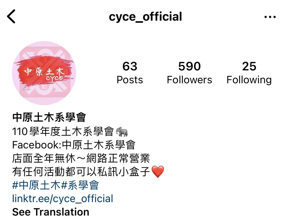
【Redesign Logo】
During my time as a Junior Artistic Design in college, I redesigned the logo of the department. To make the civil engineering department no longer monotonous, I added a soft colour' pink'. At the same time to change the stereotype of the civil engineering department, such as masculinity and boredom while preserving the majestic and handsome atmosphere, I added a hard brush of red, which is the representative colour of this department. Also, the previous logo is on the back, symbolizing that the past is not erased. This retro font is chosen because it also has modern details which look upright but solemn.
在大學做初級美術設計的時候,我重新設計了系裡的標誌。為了讓土木工程係不再單調,我加入了一種柔和的顏色‘粉色’。同時為了改變土木工程系的陽剛、沉悶等刻板印象,同時保留威嚴帥氣的氣息,我加入了紅色的硬筆刷,這是該系的代表色。還有,之前的標誌在背面,象徵著過去沒有被抹去。之所以選擇這種複古的字體,是因為它也有現代的細節,看起來挺拔卻不失莊重。


